Basic color psychology and why do colors matter when creating websites
Spring is here, at least by our side, and nature suddenly woke up from the winter and became a Queen of colors. That’s why our last tutorial is one on painting your website all over but we won’t be repeating its matters here. Head over to the User Guide section if you wish to see it.
Instead we will talk about colors, their meaning and the psychology behind them. Understanding color theory, color symbolism and the perception of colors in different cultures is invaluable for getting your message across and attracting attention. That applies to both online shops and blogs (or to websites as a whole). A visitor would love to see a nicely colored website instead of boring, monotonous page before his/her eyes.
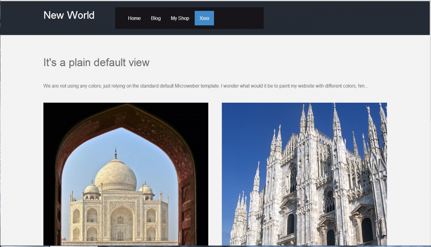
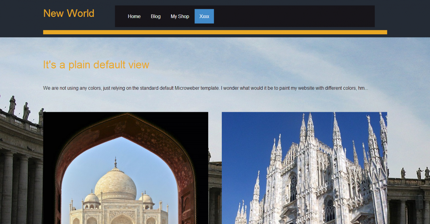
As you can see on the Microweber page we have made our choice by mixing white, grey and blue as colors and using standard black-colored text. The reason behind this is the white & blue combination being very reader-friendly and absolutely non-straining. Grey is a neutral (achromatic) color so it’s like an invisible addition that gives diversity.
Check a small difference between color/image usage we prepared for you by switching between images below:
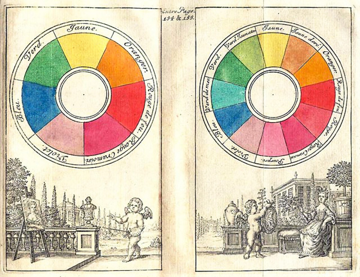
There is no set usage of X number of colors. You can choose as many colors as you wish as long as you match them nicely. It seems three colors are the optimal option though. In most cases they are:
a) a main color
b) a secondary color
c) a
highlight color for the important fields that need to stand out.
In most cases the highlight color is a lot more aggressive than the main or secondary colors. Aim for delivering a suitable ratio between the colors. Your main color must dominate over the secondary, and use highlight color carefully so you don’t overdo it. A theoretical ratio would be 55% to 35 % to 10%.
Choosing your website colors also has to do with your target audience. So for example if you’re planning to establish an online shop for chili sauce or spices as a whole you will aim to use warm and more aggressive colors like red or orange. If you’re more keen on selling consumer electronics like TVs, laptops, digital cameras, smartphones or tablets you’ll stick to neutral colors: black, white and grey. Clothes shops are to be brighter and versicoloured.
 Colors have been of great importance throughout the centuries of human history
 Let’s do a quick color breakdown. There are three types of colors: warm, cool and neutral. Warm colors evoke warmth (you didn’t expect that, right!) and the classical examples are red, yellow and orange. Cool colors are cold and bring a more gloomy interpretation – among them are blue and green. Neutral colors are almost invisible, yet you turn your attention to them and seem to be widely used – we included white, grey and black already, but let’s mention the underrated brown color which is neutral too.
Of course there surely are differences between different colors in each type. Red is warm but resembles aggression, passion, romance or even violence while yellow is warm again but is softer and has to do with happiness, joy, brightness or optimism. Blue is a cool color and its interpretation usually has to do with harmony, confidence or conservatism, the darker hues are connected to sadness or melancholy. Purple is cool too but resembles royalty (back in time Roman Emperors wore it proudly) and mystery, it’s a true colorful enigma.
On top of that you have a great deal of cultural differences regarding color symbolism. The most typical example is white: while in western countries it’s associated with purity, cleanliness and bridal ceremonies, in the East (especially China and India) it resembles death, mourning and tragedy. Yellow is happiness or joy, a light color for westerners, whereas in eastern culture it’s the sacred, imperial color that was long forbidden for common people to wear.
As you see the vast domain of colors is really diverse and interesting. It affects our everyday life and surely color usage is of great importance to expanding your online influence, be it in terms of business or just sharing your interests. So keep this in mind and pick your colors – but carefully!
What are your favorite colors? Have you made a Microweber website pairing cool colors with outstanding images? Let us know in the comments below!

Comments for Basic color psychology and why do colors matter when creating websites
Log in